
Gemstone
Beverage Bottle Project
The design challenge
Elena Scher is not your average therapist. When I sat down with Elena in our initial meeting, I immediately felt comfortable. Her office is small and intimate, tucked right off of Bee Caves road. It has tall windows, lots of natural light, and big comfy chairs. She has beautiful curly red hair and a timeless sense of style. As we started talking, our conversation felt more like a chat with a friend than a business meeting.
Finding a therapist thats the right fit for you is crucial, so I wanted her branding to give future client’s a sense of her energy. I imagined someone sifting through lists of therapists, seeing her logo, and in their gut knowing that they have something in common with her. The challenge was creating something that represented her and the work that she does, and keeping it approachable and fun but professional.
moodboard

Lorem ipsum dolor sit amet. Ut iusto culpa cum quibusdam beatae qui earum distinctio eos itaque eaque et quam voluptatibus cum saepe reprehenderit ut blanditiis quisquam. Ex voluptates nihil vel voluptatem nisi eos quia labore rem reprehenderit voluptatem et error beatae. Ut sint fugit nam rerum earum sed eveniet numquam.
Ab distinctio beatae sed similique minima non sapiente quibusdam quo omnis minus vel illo nesciunt non quam minima. Qui vero autem et odio quos ab tenetur molestiae.
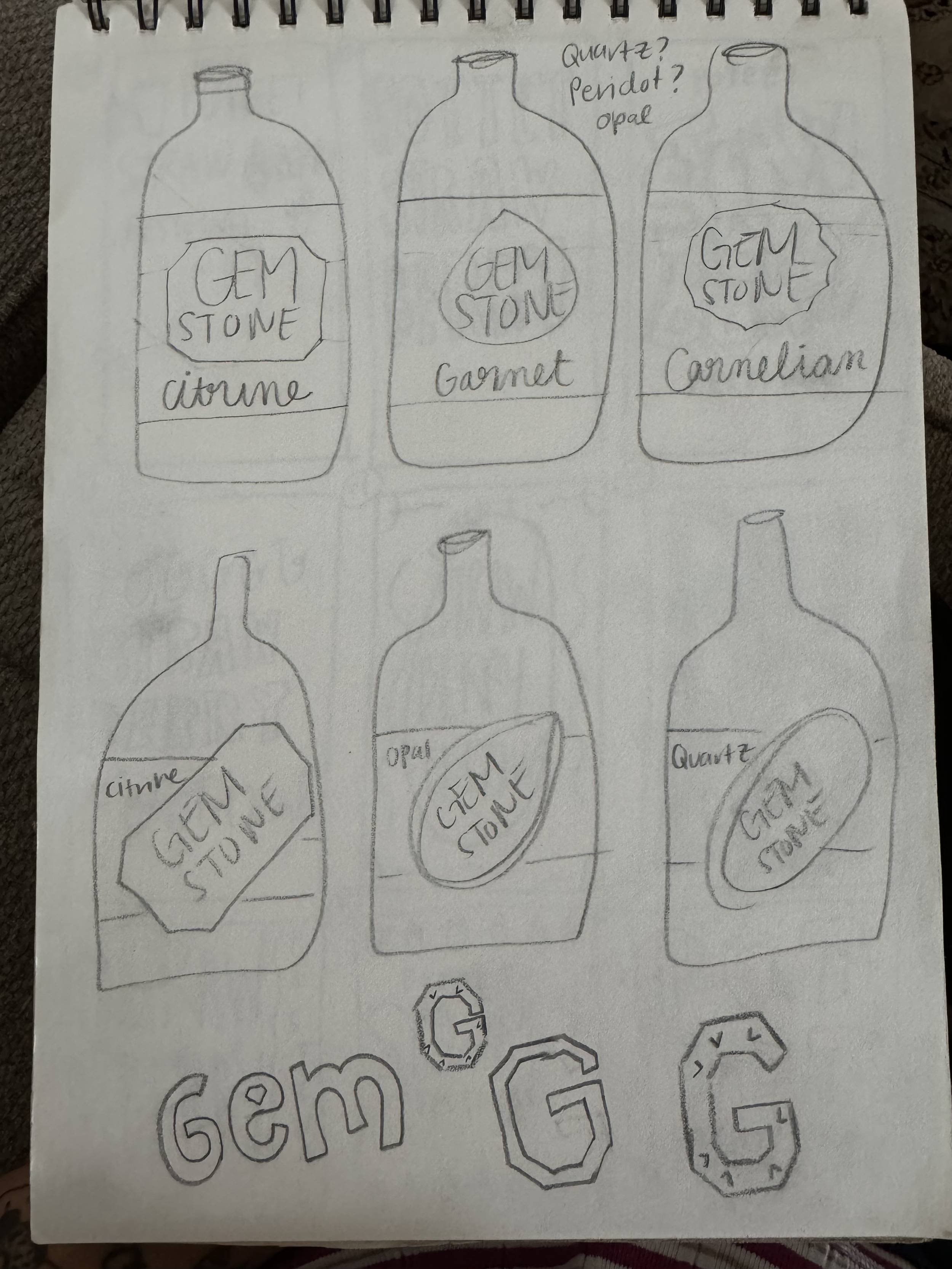
Ideation and sketches


In our initial meeting, she shared with me some of the motifs she loves. This included flowers, evil eyes, and this shopping bag that she had been saving that she loved because of the pop of neon.

Final LAbels and bottles


I continued exploring these ideas digitally, sketching in Adobe Fresco and in Adobe Illustrator. I began exploring possible typefaces and their pairings with my symbols.
I had a lot of fun creating these sketches. I experimented with combining more than one of my ideas into one logo. I played with incorporating swirls to these sketches as a nod to her curly hair. With this round of sketches, I was fighting for a balance of fun but not too casual, and also the hierarchy of her name versus the illustration.
moodboard
Lorem ipsum dolor sit amet. Ut iusto culpa cum quibusdam beatae qui earum distinctio eos itaque eaque et quam voluptatibus cum saepe reprehenderit ut blanditiis quisquam. Ex voluptates nihil vel voluptatem nisi eos quia labore rem reprehenderit voluptatem et error beatae. Ut sint fugit nam rerum earum sed eveniet numquam.
Ab distinctio beatae sed similique minima non sapiente quibusdam quo omnis minus vel illo nesciunt non quam minima. Qui vero autem et odio quos ab tenetur molestiae.